 Everest
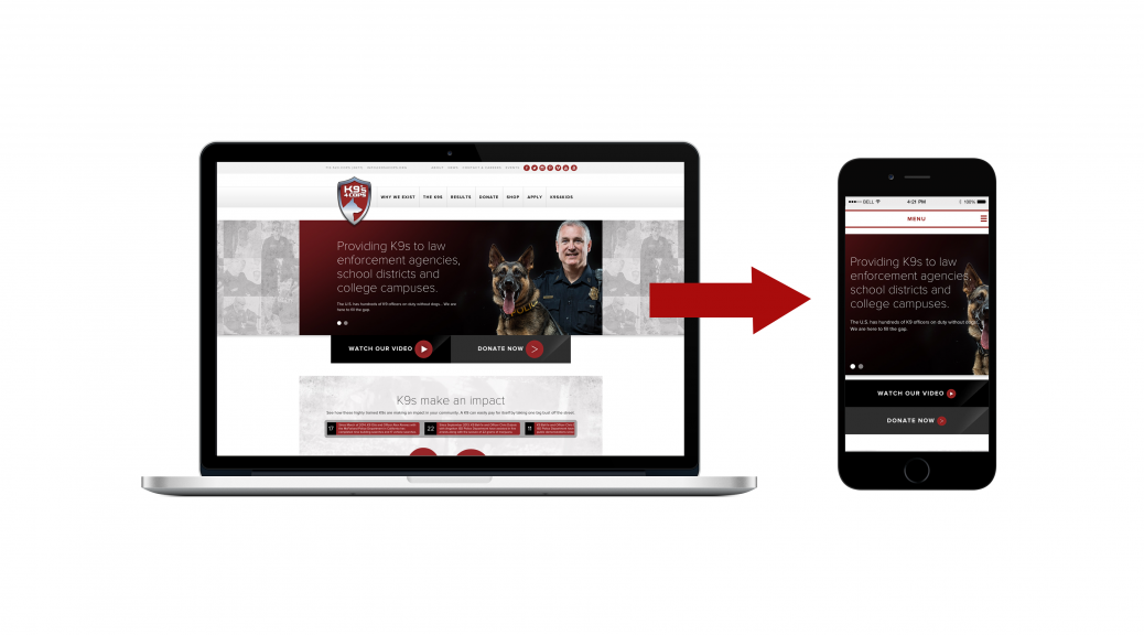
Mobile accessibility of online content is paramount. With the increasing popularity of tablet devices and smart phones, the mobile browsing market share is on a swiftly upward trend.
In order to create a site that will be sustainable, it is important to optimize content for mobile viewing. There are different options available to you when it comes to making your site mobile-friendly. These three options have different strengths and weaknesses, thus the best option for you depends on your business model.
1. Mobile visible
Your site will appear the same on all environments and devices and ensures all elements are visible. This is something all web designers should be incorporating into their design and development process.
2. Responsive design
This allows your website to adapt to the viewing environment and maximizes your visitors’ ease of use no matter what device they are on. We recommend this for clients whose sites receive at least 10% of their traffic from mobile devices.
3. Custom mobile experience
We recommend this for clients with a significant amount of mobile traffic and are in an industry were presentation is of the upmost importance. People view the way you present yourself on the web is a direct representation of the quality of your service. This will move your web presence up the ranks of mobile compatibility and keep you one step ahead of your competition.
Before you decide which is the best for your business, take a close look at where your current traffic is coming from and consider the lifestyle and preferences of your current audience.